Welcome to week 3 of the One Room Challenge hosted by Linda of Calling It Home and House Beautiful! We’re making good headway on our naturalist living room makeover. There weren’t a lot of outward changes to the room this week, but most major decisions have been made at this point. The large furniture pieces and accessories have all been ordered and should be here as early as tomorrow! I’ve also started picking out smaller accessories and finishing touches.
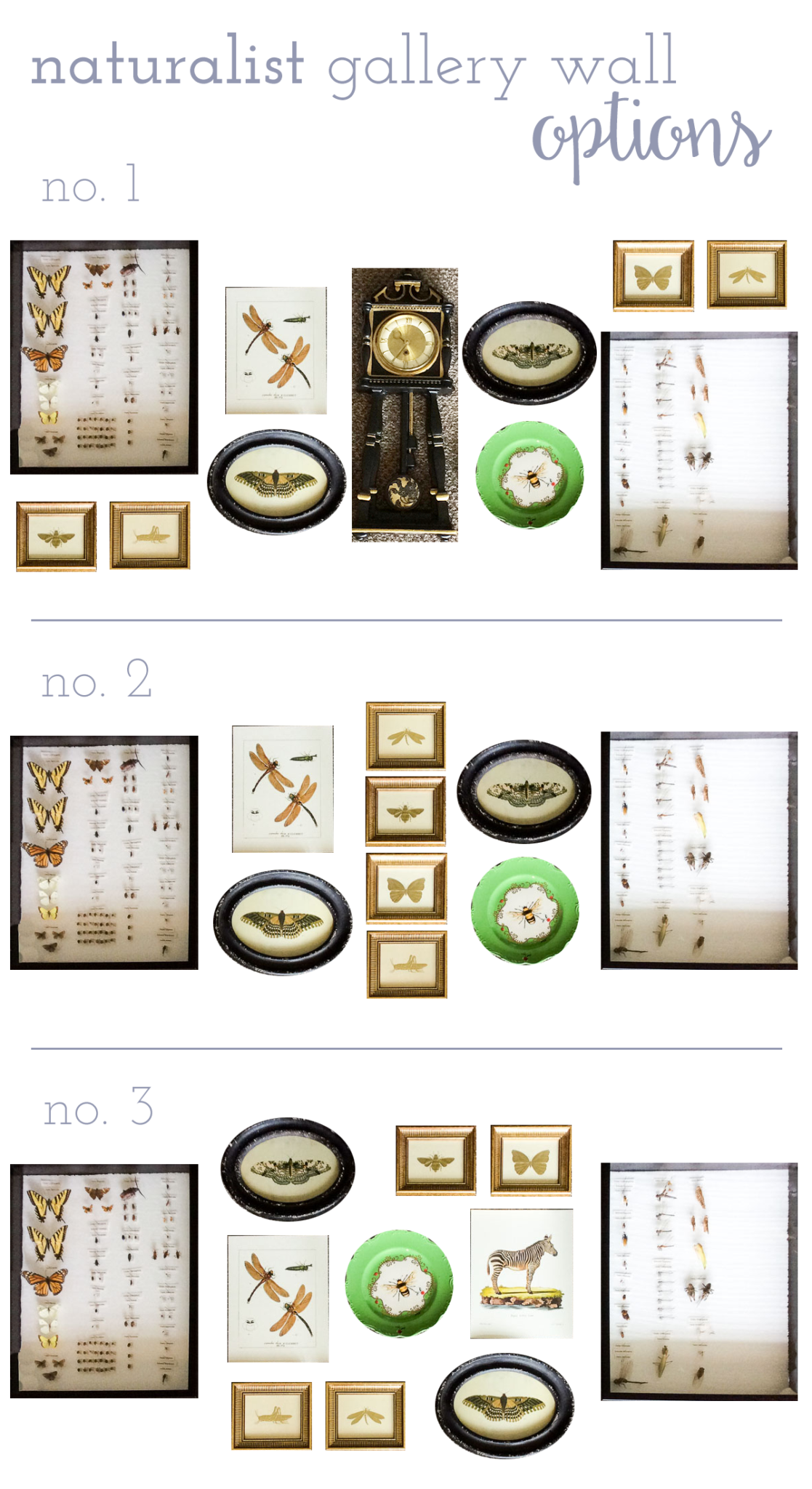
One of the visible things I worked on this week was the layout for the gallery wall that will go over the upright piano. In our old house, the piano had a very large, black-framed mirror hanging over it, but I wanted to do something different in that space this time around. Over the years, I’ve bought and been given lots of flora and fauna art pieces, but we’ve never had a place to hang them. And they all go so nicely together! So, I pulled everything out this week and started experimenting with different layout options.
The pieces we’re working with include
- 2 large insect collections in black-framed shadow boxes: My husband and I both made bug collections for classes in college, and I love them. These 2 big boxes are mine, and my husband’s is smaller and can fit in the empty space in one of the big boxes. I would love to take all the bugs out and cover the styrofoam with fabric (maybe natural or white linen??), but that sounds like a lot of work!
- 4 small, gold foil-embossed insect prints in gold frames: A gift from my mom decades ago.
- 2 vintage-inspired butterfly prints in distressed black oval frames: I bought these a few years ago from a local boutique and am excited to finally get to hang them up.
- 1 green bee plate from Anthropologie: Another gift from my mom!
- 2 prints from the book Natural Histories: The dragonfly print and zebra print (which is a placeholder for something I haven’t picked out yet) are both reproductions of prints from the rare books library of the American Museum of Natural History. You can buy this really cool set that has a coffee table book and 40 beautiful reproductions that are ready to frame.
- A black plaster wall clock with gold accents: When I was in high school, my mom bought me this super old, weird plaster clock from a collector who lived next door to my Nana. It was a hideous, sickly yellow color. She intended for me to paint it, which I did. I painted it black with gold accents, and it used to hang in the living room of our old house. It is one-of-a-kind, and I’m definitely planning to hang it in the living room, but not necessarily above the piano. We’ll see.
So that’s what we’ve been working on this week, in addition to picking out and buying a whole lotta stuff! I’d love to hear feedback on which layout option you like best. Keep in mind that the gallery wall will be above a black upright piano and against a gray wall, so not quite as light and airy as the white background on my blog. I think I’m partial to the third option with the green bee plate in the center. But let me know what you think!!
You can read about our week 1 progress HERE and our week 2 progress HERE. Check in next Thursday for a week 4 ORC update, and be sure to check out the featured One Room Challenge designers and guest participants HERE on Calling It Home.

**This post contains affiliate links. You can read more about them on our policies page.**

I like the third option best, too.
I think #3 is winning so far!
This gallery wall is going to be fabulous!! I do like the third option, which highlights the plate…but I also like the symmetry of the second option. It will look great, whatever you decide!
I feel like I need someone else to come install this and just surprise me, lol!
I vote for 3rd option too!
It looks like everyone likes 2 and 3. At least that narrows it down, lol!
I like the #2 the best, though I am symmetrically-minded to a fault, sooooo. But #3 is my next favorite. Mr. Zebra is a bit of a surprise amidst so many insects! ?
And I love symmetry, lol! When I see #3, I’m like, yes! The green needs to be centered. SIGH!
So many great options. I like #3, it has a bit of quirkiness (hello, Mr. Zebra!)
I like 3 too, but the zebra isn’t staying! Darn! I’m still waiting for a floral print from Minted and stuck the zebra there as a placeholder, lol. I’m torn between 2 and 3. What to do, what to do?
My vote is for #2. Number three looks like tic tac toe three in a row with the two black frames and the green bee plate. My eye goes to those first then to the rest of the display.
The clock sounds like it has special meaning to you but it’s too heavy with the other pieces in #1.
My husband made your cinnamon rolls last week. They were pretty good but my favorite is still your Mom’s Maple Pecan Ring. Thanks for letting us know about the book price on Amazon. I bought a couple extra for gifts. Your autographed book sits proudly on our coffee table. Blessings Melissa
First of all, Awwwwwww! It makes me so happy to hear that you love the book and have bought more as gifts! Second, I totally agree about the clock being too heavy. I think it can be on it’s own on a different wall. I’m really torn between 2 and 3!! I’m still waiting for 1 more print, so I have a little more time to decide. 😉
Oh, so tough, they’re all good! I’m leaning towards 3 too though – that bee in the center makes it!
My eye goes to that one too, but I’m so indecisive!!
I like 2! I love the green frame, but I prefer it in a more random spot than right in the center as a feature. That’s weird for me too, since I seem to always pick matchy-match and perfectly balanced No matter which arrangement you choose, it is a beautiful assortment. I think ultimately, there is no wrong answer.
Thanks, Stacy! I still haven’t finalized the position of everything. I’m leaving it until the last possible second!