It’s been a few weeks since I posted here, and I’m back with something exciting that has been in the works for a few months—a blog makeover for Lulu the Baker! You probably think the site doesn’t look drastically different than before, but everything from top to bottom has been spruced up, made over, and smoothed out, and some new features have been added that I think you’ll love.
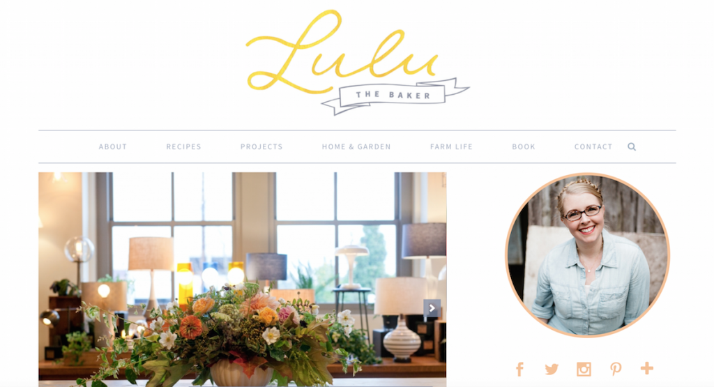 Here’s what’s new…
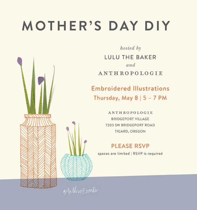
- At the beginning of the year, I asked the illustrator for my book, Andrea Smith, to do some illustrations for the blog and to redo my logo, and those designs are finally incorporated into this new blog design! Andrea does beautiful cut paper illustrations, and I’m excited for her work to be featured not only in my book, but also here on Lulu the Baker.
- The search box has been taken out of the sidebar and moved to a new, permanent home at the top of the page. If you need to search Lulu the Baker for anything, just click on that little magnifying glass icon on the far right end of the navigation bar just under the logo.
- The colors look a little different! The beige text and design elements have been replaced with a soft blue-gray, and there’s a pretty peachy-orange thrown in for fun.
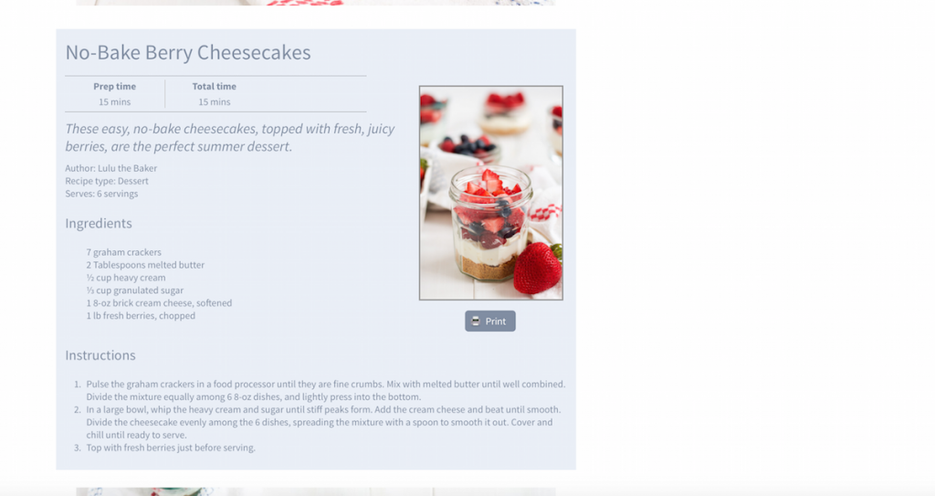
- The recipes are formatted a little differently. There’s nothing functionally different here, but I think the recipes look a little prettier now.
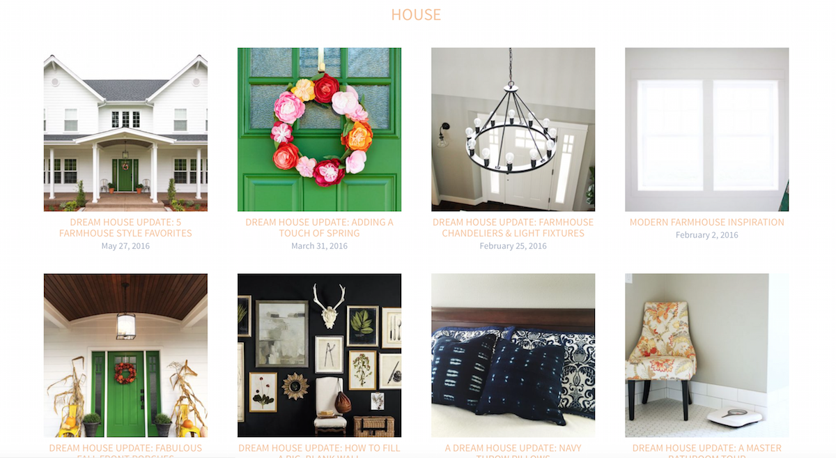
- This is probably my favorite new feature on Lulu the Baker: all of the categories that you click on in the navigation bar are broken down into subcategories with pretty photo galleries! So, for example, if you click on “Home & Garden” at the top of the homepage, you can see the two subcategories, “House” and “Yard and Garden,” and the eight most recent posts in each subcategory accompanied by a beautiful photo. Recipes, Projects, and Farm Life all have similar galleries broken down into subcategories.

- And at the bottom of each page is another cute Andrea Smith illustration next to my latest Instagram posts.
So that’s a quick tour of the new features of Lulu the Baker! There are a ton of changes that have happened behind the scenes to make the site run more smoothly, lots of plugins added, deleted, and upgraded, new pages made, and things rearranged. It is entirely possible that there are some broken links or hiccups, and I’d love for you to let me know if you run into any problems. Huge thanks to Ryan and Nick of Roundhouse Designs for doing such beautiful work on this redesign. Seriously, if you need any work done on your blog or website, they are a dream to work with.
I really enjoy your blog however for me I cannot see the beige or yellow writing very well on my smart phone as it doesn’t stand out enough. It blends into the white background and makes it difficult to see the writing well enough to have continuity in reading. I’m just letting you know. For what it’s worth.
Thanks for the feedback, Katheryn. I’ll see what we can figure out.
I love it! Well done, my friend.
Thank you, Marcelle! I miss you!!
Congrats on the new site launch! We are stoked with how it turned out.
Thanks, Ryan! You guys did an amazing job!